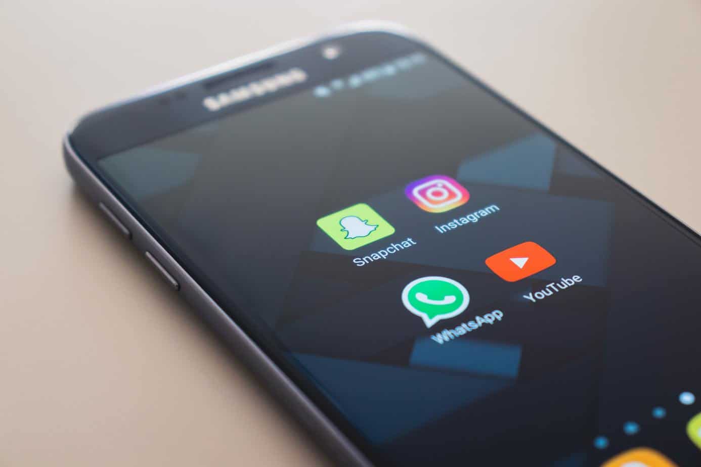
Social media is our go-to-place to keep a tap on the daily news, and what is happening around the world also making it the world’s best market place. Everybody can agree to the fact that social media logos are pretty tricky. When you have hundreds of users using your application, you cannot afford to upset them by introducing a lousy logo. People today have various alternatives, if they do not like anything on Facebook they can swiftly shift to Twitter, if not Twitter then Instagram, Pinterest or LinkedIn, that is how vast this social media network is.
Despite the fact that it was just yesterday for Generation Y when social media came into this world and transformed the whole social circle for most of the people today, yet there have been many iterations that their logos have been undergone. As the internet mourns the loss of the old logos of Facebook and Instagram let us take a peek at the evolution of social media icons through the ages.
Let’s see what actually is driving these changes and how effective they have been in this journey and what exactly do they have to teach us through their evolutionary journey. Without any further ado, let us hop into this journey.
1. Facebook
Starting with our most favourite and most visited social media network. For those who do not know Facebook started as Harvard University networking site, which was initially, names as Facemash and TheFacebook. Once its name was changed to Facebook, the founder of Facebook Mark Zuckerberg recruited Mike Buzzard from Cuban Council to give this name a professional look which is to design a logo for it.
As shown in this picture, the logo was the simple modification of the typeface Klavika that Eric Olson designed. Buzzard oversaw the logo project, and Joe Kral completed the overall project.
The idiosyncratic colour was chosen because of the colour blindness of the Founder of Facebook, which meant he could distinguish blue colour only. The first Facebook logo was clear, scalable and clean, everything that a logo needs to be. For the next whole decade, Facebook used this logo as they got it right in their first attempt only.
Later in 2015, the Facebook logo went under some changes, which were not quite noticeable as you can see spot in the image. These changes resulted in the alterations to a single deck “a” and a stem on the letter “b”.
Now that there is a broad user engagement on these applications, it was essential for them to upgrade their logo in 2019 with a new circular icon replacing the dark blue block of the old design.
Lesson learned:
Once you have got your logo right in the first attempt, you are all set for the next decades. While as tempting as the no cost graphic designers services are; mainly for the startups, it is wise to go for the professional designers.
2. Twitter
As compared to the Facebook logo, Twitter has been under many changes and has taken quite a varied approach to its logo designing. It perhaps reflects a lack of clear business vision for the platform since it has been around for 14 years, but it started making profits only in 2018.
Linda Gavin, a Swedish graphic designer, created the first logo of Twitter in a day only. It spelt out the company name is fun and childlike letters, the logo effectively evoked the image of inclusivity and friendliness.
Later in the upcoming years, Twitter has undergone a few changes in the years 2007 and 2009. The third logo design of Twitter was released on June 5, 2012. This year Twitter had seen significant changes in the logo as it was redesigned into a Twitter Bird icon. Bird design is basically based on the mountain bluebird with its wings that are created with the three overlapping circles.
Later a few days ago, the Twitter update showed a simple blue box with no bird or twitter written on it. It was when the users lost their cool and demanded the old logo back. However, later it was made clear that there was never a plan to introduce a square logo and the bird logo remained.
Lesson learned
One of the most important things to learn from the Twitter logo evolution is that one must know about the goals and strategies of the business that the brand is aimed at achieving. Conversely, a visual identity that is all over the place suggests that maybe the underlying business is widely spread too, which is good news.
3. Instagram
Instagram is widely used for business purpose today and other than that, it is the go-to-place and bread and butter for most of the influencer marketers. There is no denying to the fact that in terms of the user engagement and global reach, no other social networking site could beat Instagram. The evolution of its logo clearly represents its sense of clarity and purpose.
Comparing the first and current logo of Instagram shows how massively it has changed, Kevin Systrom designed the first logo in 2010, and it looked more like an old-style Polaroid camera. Later in the year 2011, the logo was changed into a more straightforward camera icon but still skeuomorphic with the help of Cole Rise, a professional photographer and a designer.
Instagram has gone through some massive changes until 2016, but finally, in 2016, Instagram released a dramatically minimalist and new design that they created in-house in nine months.
Lesson Learned:
The broad recent trend of the logo is to go with the less is more mantra and adopt a minimalistic approach. It is safest to adopt this strategy gradually and monitor the transition from one stage to another. However, if you are a well-known brand, you can do it in one- go too.
4. YouTube
YouTube is our first resort whenever we have to watch any video or search anything, not many people know this, but YouTube serves as a search engine as well making it a multi-purpose website. The evolution of its logo is a perfect example of how a mere logo can be simplified and streamlined over time.
Nobody today can remember the time when YouTube was not there; I mean, how different life would have been then. Nevertheless, former employees of PayPal Chad Hurley, Jawed Karim and Steve Chan launched this platform in 2005 with a simple logo of the word Tube inside a red rounded rectangle like television.
Later in 2011, YouTube introduced a new logo with a flatter rectangle in a darker red shade. 2017 was a turning point for YouTube logo as it dropped the TV shape that surrounded Tube and pushed it to another side, making it like a play button.
Lesson Learned
Bringing changes in your logo is a smart choice, however, if you do it subtly and gradually your users are more likely to stay on your side.
Conclusion
Social media platforms have undergone various stages of evolution, each year making it better to ensure their users are happy and attracted to the logos. These platforms deal with thousands of issues daily from failing to deal with, from fake news to online abuse and the notion you have the time to mess around with altering you logo can seem like a huge risk.
There has been a drastic change in the logos of most of the social media platforms; some mediums have been pretty successful in changing their logos whereas, on the other hand, some had to face criticism in their evolution process. It is safe to say that being smart, wise, and aware of their business goals is essential in the logo designing.


