
70% of total digital media time in the US is spent on smartphones. The growth in the volume of mobile traffic could not go unnoticed. As a result, algorithms appeared in search engines that evaluate the mobile version of the website in the first place.
This means that if your website isn’t optimized for smartphones, tablets, and other portable devices, it will be much more difficult to promote it.
On the contrary, optimization for mobile may result in:
- increased traffic
- increased CTR (click-through rate)
- higher positions in the search results
- increased site conversion.
In this article, we will tell you how you can get your site and the phones of your customers to be friends, and how this will affect your business.
-
Test a website with mobile-friendly tools
If you aren’t sure whether your website is mobile-friendly or not, there are many tools that will help you find out. Here are a few to try. Most only require your site’s URL to run the test.
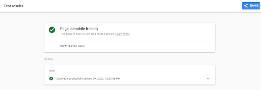
- Google’s Mobile-Friendly Test (keep in mind that the tool works on a page-to-page basis, so be sure to check everything);
- MobiReady (the tool shows how a particular page appears on various types of devices such as desktop, low-tier phone, mid-tier phone, and high-tier phone);
- Pingdom (monitor your site’s uptime, performance, and interactions for the best end-user experience);
- Page Speed Insights (in addition to speed, the tool helps identify the problem areas on the websites and offers ways to fix them);
- BrowserStack (tests on 3000+ real devices and browsers).
-
Use only a reliable web host
Fast and reliable web hosting heavily influences your resource performance. If you choose a good web hosting provider, you can rest assured that your website will run at an optimal speed.
The best web hosting services to consider are:
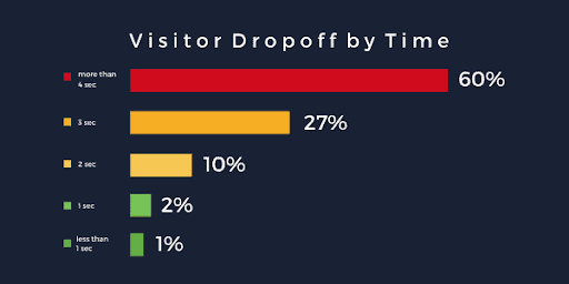
We usually use smartphones on the go, and if we go online with them, we expect to find the information we need quickly. While loading speed has been a major ranking factor in the past, it has grown in importance even more now. The user won’t wait for the page to load but simply go to competitors. As a result, the site loses traffic, and its owner loses customers. The maximum loading time should be 3-5 seconds.
Below are the most popular ways to improve your website loading speed:
- clean up the source code – remove unnecessary characters;
- compress images using special compressors (Tiny PNG, Compress Now, JPEG Mini);
- use modern image formats – JPEG XR, SVG, WebP, JPEG 2000;
- remove unnecessary functions – a bunch of unused CMS plugins slow down a website loading;
- optimize server performance – use caching for smooth operation.
-
Keep the mobile version in mind while designing
While your content is one of the main reasons users are drawn to your website, its design considerably impacts your site’s bounce rate. That’s why you need to make a great impression from the very beginning.
So let’s take a look at what things to consider when designing a mobile version of a website.
For example, the font used for the mobile version must be readable. Too small will be difficult to see; too large – will stretch across the screen, providing an incorrect display.
The situation is similar for the elements that the user will click on. They should be adapted not only for a small kid’s or female finger but also for a large male finger. If you need to make a lot of clicks for a transition or other targeted action, this will alienate the user.
On top of that, if the links are located too close to each other, then it will be inconvenient for the user to click on them. All of this will provide multiple empty transitions, annoyance, and possibly the loss of a potential client.
Also, keep in mind that the screen of a computer or laptop is larger than the screen of a smartphone or tablet, so you need to hide excess content. For example, you can remove unnecessary pictures, descriptions of articles, and everything that interferes with correct display and loading.
Some developers and designers focus on the desktop first and then scale down the design for the mobile version. However, reversing this workflow can help you optimize the design from the start.
-
Create a mobile app if you can
In some industries, websites are rarely visited from phones. So businesses replace them with applications. These are usually the services that customers often use. Determining whether your business needs an app is easy:
- Research your competitors – if they have apps, you also need one to stop it being their advantage;
- Calculate how often customers use your service – several calls per month from one customer are already a reason to think about the application;
- Think about whether the mobile version will be really convenient – more often than not, applications allow you to make the interface much more client-oriented.
A bank, a food delivery service, a taxi service, or public transport monitoring definitely need an application. Large online stores are also switching to apps, making purchases more convenient through them. As a result, people buy more often, which pays for the cost of software development.
Ready to promote your mobile-friendly website?
Tell people that you launched a new, mobile responsive website. In addition to posts on social media and a newsletter, you can include the link to your website as part of a well-designed banner in your email signature. This way, you can promote your website, even if you’re not emailing someone specifically about that. The banner, which can be created with the help of an email signature generator, sparks recipients’ interest.
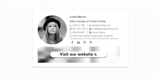
See more email signature examples.
Conclusion
With smartphones now dominating the world of web browsing and millions of people googling on the go, having a mobile-optimized website is critical.
In this article, you will find five things to consider to improve your website for a better mobile user experience.