Every text on your website uses a specific font style. Each font must synchronize with the other to form a harmonious interaction. How you pick the fonts that you will use on your site is up to you.
Each typeface and font that you choose will need to function as a unit in support of the main idea, a call to action, and other elements in your web design.
Think of it as a team effort, with each member having a different skillset, working together to achieve a certain goal. That’s how typography works for your web design.
People’s preferences change almost every year. Let us look at 2019 as our example. Last year, bold typefaces dominated the charts. A bold and outlined typeface was also a hit last year.
The typography trends last year featured an outgoing, bold, and loud message. This year, the focus of typography trends is on the vibe of the text. Typography trends in 2021 will radiate a more humane and revitalizing feel.
Even if it’s tempting to use the most famous font on your website every year, this cannot be the case. Your fonts should synchronize with each other to portray a message and highlight your brand even more.
It is important to stay updated on the trends in typography for your web design. In this way, you can keep your website fresh and up to date.
The Countdown for the Top 10 Typography Trends in Web Design for 2021
#10: Maximum typography
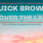
Maximum typography, also known as maxi typography, uses large font sizes and sans serif typefaces to maximize the space. Maximized typography can even go beyond the canvas if you want a stylish design.
This dynamic and loud bold font never ceases to amaze people because it is effective. Readers can easily notice your brand’s identity. This also highlights your website’s message to its readers.
The irony is that even when you have a large font, the smaller ones will still be the highlight. You can even pair this with a layered web design to add contrast. Because of its impact and reliability, this design is still a go-to for web designers.
#9: Moving typography
More and more websites go for animated text and kinetic fonts these days. Because of its futuristic and technologically-advanced design, people want to incorporate this into their websites.
This typography showcases a fusion of old-school design together with animation. Graphic designers often use this type of typography to showcase their skills. It’s like letting the website speak for itself.
Back in the early stages of development for this technology, this would’ve been a pipe-dream. Now, you’ll see this typography more and more on website landing pages and mobile applications.
These wildly entertaining and exciting kinetic fonts push the limits of typography. Some even consider this as experimental. But, with its success, people use this to show how technologically savvy their brands are.
If you lack the experience and expertise in making animated fonts, you can seek help from experts. You can try looking for a digital typographist or a web design company that has a team of professionals for your site’s animated fonts. You can upgrade your web design by placing animated fonts on your landing page.
#8: Retro
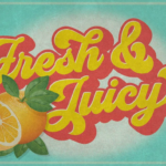
Harnessing the power of the ‘60s and ‘70s pop culture, disco fever still lives on. This typography trend surfaced after the popularization of vintage typography back in 2018.
Retro typography makes graphics look like they came straight out of a ‘70s product ad.
This retro kind of typography showcases flashy, neon-colored characters and bold typefaces. It gives off an old-school vibe that gives its viewers a pleasant feeling of nostalgia.
#7: Pixel art
Using 8-bit graphics on your website can also have a nostalgic feel. Such 2D graphics existed back in the ‘80s, way before typography was relevant.
This decade reminds us of the fun and excitement 8-bit arcade games brought to us. It also gives your design a positive outlook and opens up new possibilities.
There are always font designs that you can access online. If you incorporate bitmap fonts into your web design, you’ll be able to evoke that old feeling of joy and exhilaration for your readers.
#6: Outline and overlay fonts
Nowadays, graphics designers are using the negative space of outline fonts to their benefit. Admit it, it looks good. That’s why we have overlay fonts and outline fonts in our trending typographies for 2021.
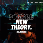
A Japanese brand’s website shows us the beauty of having outline fonts in your web design.
Outline fonts take advantage of the negative space in between the outlines. Be careful though, as it may not be as readable as you think it is. These outline fonts can be lost when paired with fast-paced background animations.
You have to consider the placement of the outlined text, the color of the outline, the thickness of the outline, and the contrast with the background. Usually, you will find these standards in making an outline font:
- Sans serif typeface
- All caps text for outlined characters
- Filled text for subheadings/supporting statements
You have to use the outlined characters correctly if you want to make it effective. Use it well and don’t overdo it. Use it to emphasize your message rather than for the whole message itself.
#5: Minimalist typography
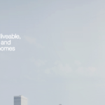
The idea behind minimalist typography is to create a lot of breathing room for your text, further emphasizing how important it is. Each letter becomes more important because they are the only ones you see on a landing page.
A fresh and minimalist design for a real-estate venture.
This typography solely relies on the power of your message. The more powerful your message is, the more minimalist typography magnifies your message.
The purpose of this design is to communicate simplicity, practicality, sophistication, elegance, and professionalism on your website. In this case, less is always more.
#4: Serif + Sans Serif typography
Combining two typefaces has always been a technique in typography. But the serif and sans serif combination will never get old.
This combination works both ways. You can highlight a message using a serif typeface and have a supporting message in sans serif, or vice versa.
The flexibility of the typefaces allows you to create a myriad of combinations and experiment with your design. It’s like a mix and match, but with typefaces.
However, you should be cautious about this. Not every serif typeface is compatible with a sans serif typeface. You should still consider applying font pairing basics in your design.
#3: Rounded sans serifs
Viewed as a modern typeface, rounded sans serifs are still included in typography trends for this year. This showcases a simple and minimalist design.
This typeface is commonly used for digital content due to its readability. Because of its simplicity, you’ll barely even notice these typefaces on your website.
Don’t get me wrong, this is not a bad thing for your website. This makes rounded sans serifs even more versatile because you can pair them up with other typefaces. One prominent example is the sans serif typeface used by the prominent booking company, Airbnb.
#2: Featured words
As a visual language, this typography relays the message clearly.
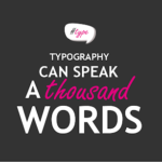
Indeed, typography can speak a thousand words. Highlighting the most important aspect of your message gives more weight and in-depth meaning to your words.
With a mere glance at the words, you can get what message is being communicated; your website is clearly conveying its intent.
All you need to do is to change the color and font of a single word, and you can watch your message ring louder and clearer. You can use this typography on your call to action to elicit a specific response from your readers.
#1: Personalized typography
If you want your message to go straight to the heart of your viewers, personalizing your design is the path you’ll want to take. Hand-drawn typography is the biggest trend in typography this year.
The impact that this typography has is undeniable. It adds a human touch to your text as if you’re personally communicating it to your readers.
This typography uses curved lines and handwritten fonts to depict a creative, approachable, and friendly environment for your readers. Add a strong secondary message in a simple sans serif and you can maximize the impact of handwritten typography for your website.
Your Choice Matters
You can choose from any of these typography trends to use on your website. You can incorporate pixel art to make your website more futuristic, or have retro typography for that nostalgic feel.
Personalize your typography and add a human touch to it. Communicate and connect with your readers on a personal level.
Whatever your choice is, keep in mind that it’s not about the design. It’s still about your website’s message. Your website’s message is communicated in your choice of typography.
No matter how trendy and stylish your website’s fonts, it will be of little use if your choice of typography doesn’t reflect the message of your website. Choose wisely.

